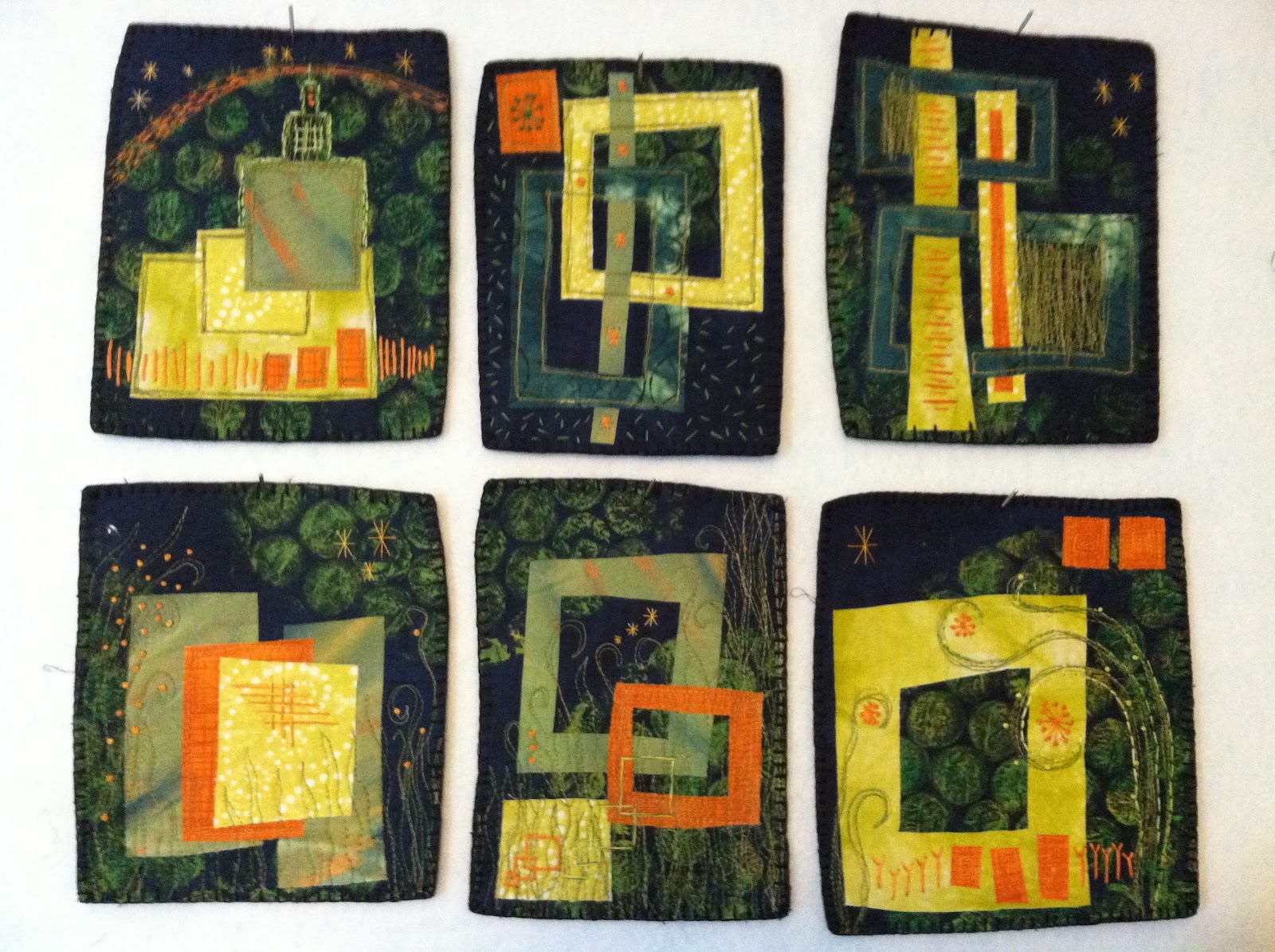
 Saturday at Deborah Boschert's class
Small Art Quilts: Designing a Series
my goals for the day included:
SIMPLIFY - spending more time sewing and less time agonizing... so when the supply list called for 6, I brought only 9 - not 39!
SEW MORE - selected the "4 sided angular shape"as my design element (maxing my design time and maxing my time to sew, by cutting out the extra cutting time!)
HAVE FUN - fun to work at something that you enjoy - I love the handwork!
Color Scheme
I picked colors based on my inspiration fabric - FUN hand painted and hand stamped fabric I made in Lyric Kinard's Playing with Paint class through Quilt University this summer.
 Background is a commercial mottled fabric that I had gelatin printed with bubble wrap. Orange is commercial print, one yellows is from my Lonni Rossi scraps by the pound grab bag, other yellow is from my first handdying, pale green is hand painted fabric, dark green is handdyed and stamped (from 12x12x12). So I actually used 6 fat quarters - hmmm, lesson? listen to the supply list!
Look at what I found in my orphan blocks box... I think it's a sign that the 3 sided Angular Shape wants attention and I should continue to play with this color scheme!
Design
Here it is early in the design process - the top set was nice and clean/simple but the bottom had a complicated flavor -AND for the series to be cohesive, I needed to go one way or another - AND I wanted to be able to go wild with stitching both hand and machine, so I went the simple route!
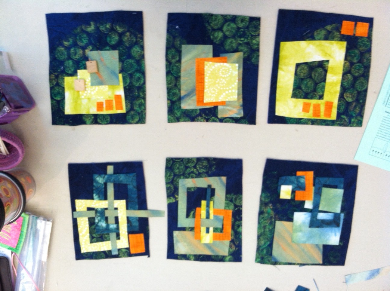
I think the complicated bottom ones would be good to do on a much larger scale... ideas!
there was something very compelling in the weaving of strips and frames... I had to keep some of that in...
Can you see that this was done on my nephew's 11th birthday? and that I am one of 3 sisters?

Stitchin'
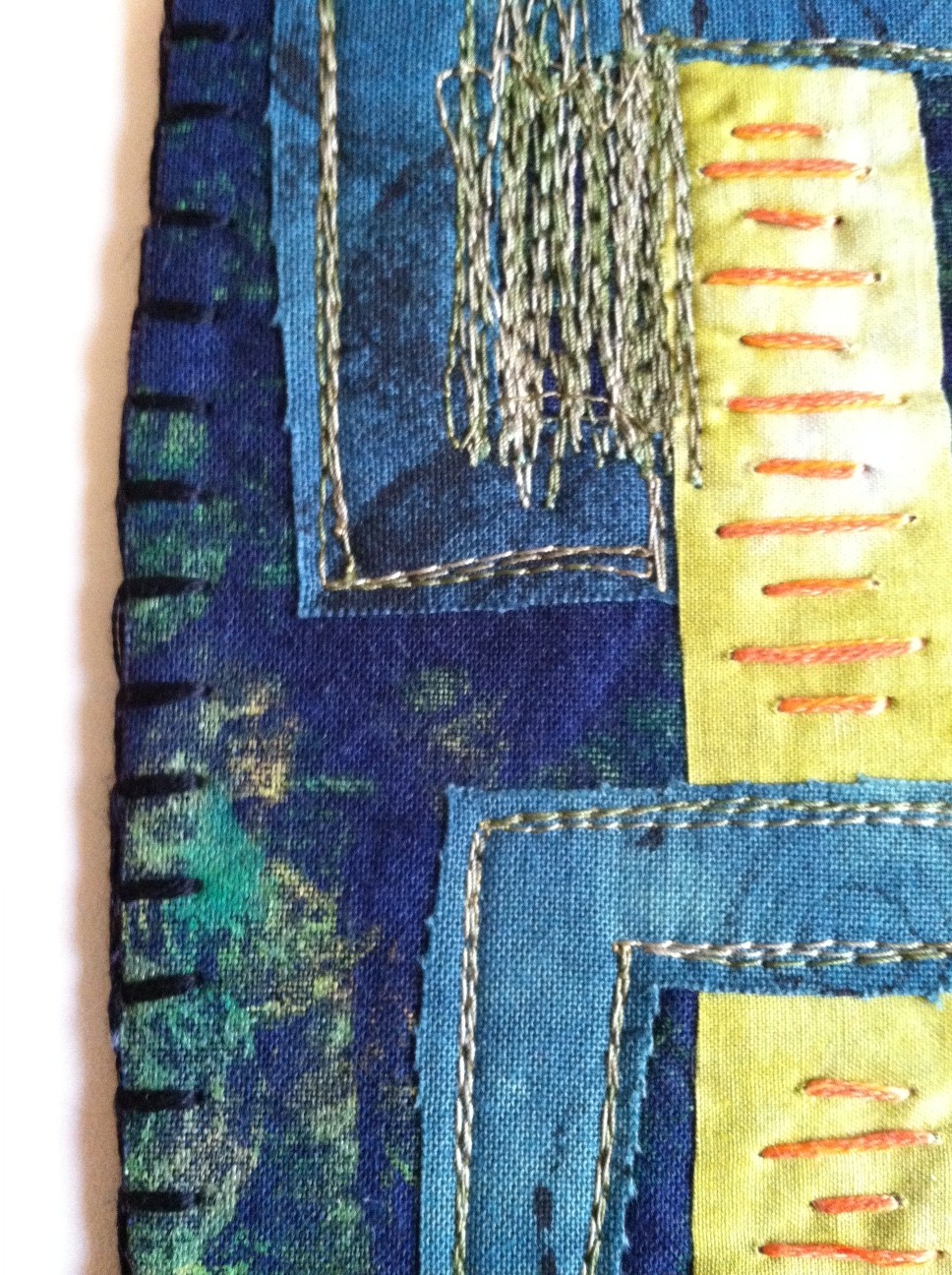
Denying my nonconformist nature, used some embroidery stitches from the class handout... But soon my nature emerged as I stitched the bars on my twin towers piece (bottom right), and stagger longer and shorter bars up the left tower. I felt like some of my machine stitching was weedy looking so added some loopy weed heads...

Added some weaving, squares, stars, bars, y's and french knots (last count was over 70 french knots before adding the alien flowers),
 Something about the bottom left one looked wrong, so I turned it upside down... hmmm - a flag pole with 2 flags and a detail at the top? hmm, what would Rorschach say?
I wanted to do a blanket stitch in navy blue, but didn't have it and didn't want to wait to get some, and had black dmc floss. I like the black edge on the navy background! Lucky I didn't have navy blue!
reordered the quilts so that the weeds are growing up from all of the bottom 3.
Lessons and Confessions
Lesson 1 - free cutting is fun, takes a creative leap of faith, but it's freeing and loose. That overall looseness is a design element in this series...
Confession 1 - NO ROTARY CUTTER OR RULER USED IN THE CREATION OF THIS SERIES... in fact even did free motion sewing - the feeddogs were down for all the machine stitching except the arc across the sky in the Mission Church
 Lesson 2 - navy background was a comercial print and comercially printed fabric has the color laying on top, so the back is lighter and the cut edge is also
Confession 2 - I inked the edge after the blanket stitch with my favorite tools - the humble sharpie - but the fancy "clicky" one in black...
Lesson 3- hand painted fabric has a slight stiffness makes for fantastic raw edge applique if you don't want any pokeys like in the other fabrics - the light green has a very crisp edge.
Confession 3 - I don't have another confession, yet am compelled to have a balance of confessions to lessons (I guess that's my confession!)
Lesson 4 - DON'T FEAR THE REAPER, you need to prune! Sometimes it's what you remove... I saw many times in the designing that removing a part allowed the rest of the piece to breathe.
Confession - Took photos or saved parts removed - those can feed another project. This color scheme, loose style, simplicity is very appealing to me and it might just become a large singular piece... That's my next mission, should I chose to accept it!


